Welcome, come on in. To your right, you'll find a fine array of very good resources for web-based design. I've done a lot of research, continue to do more, and would love to hear from you if you've found other great design sites. Please don't hesitate to email me with questions or link/article suggestions. That's why we're here!
Sunday, November 27
Who wants pumpkin? I do!
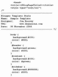
 site look great by applying colors will require us to find at least these three sections: Header, Content, and Sidebar. The names may be a bit different in your template,and there are plenty more, but we'll start here to keep things clear. Here's our wildly simplified sample Style Sheet:
Can you read it? What we have so far is our old white background and black text for anything outside the other sections (body). Our new header, where your blog-title would be, is green with white text. The section called content (where blog-posts go) is white with green text. For your sidebar, we have an (evil?) gray background and more white lettering. Pretty dull stuff, but better than black & white, maybe. Don't worry, we'll dress it up soon.
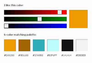
The color scheme I showed earlier as a sample is already taken, by the site you're reading right now. So let's choose a new palette for your blogsite. While we're at it, we'll build a sample site based on a very simple layout, using just the parts listed in our abbreviated style sheet. Then we'll splash your six colors around and see if we can create something jazzy. Here's our new palette:

These colors will be loads more fun than the ones I listed above, although the pumpkin primary choice looks a bit garish. I did say jazzy, though, didn't I? By applying different choices from our new palette, we will instantly transform our simplistic blogsite. I'll call the colors by numbers one through six, left to right. Let's try this:
Body: #2 background, with white text.
Header: #1 background, with #5 (black) text.
Content: #6 (gray) background with #3 main text.
Sidebar: #4 background with #2 (brown) text.
I can't promise you this will be a stunning site, since I haven't yet tried it, but you and I will put it all together in the next post, and view the results together.

