

Welcome, come on in. To your right, you'll find a fine array of very good resources for web-based design. I've done a lot of research, continue to do more, and would love to hear from you if you've found other great design sites. Please don't hesitate to email me with questions or link/article suggestions. That's why we're here!
Monday, November 28
Why Bother??

With so many websites devoted to website design, why would I bother to construct this little blog site? Reason one, is just to try it. Reason two, the more important one, is to help me organize and reference all the amazing help information I've already stumbled across. My Favorites group, folders, and loose-listings had already reached the point of uselessness after just a few weeks' blog-hunting. I needed a way to make it easy for me to find info quickly, and visually. Folders just don't cut it. Not only that, but I had found multiple sources for similar questions. I needed to group them together, but separate. Not an easy task, working with-in the Favorites folders. This website will let me do everything I want to do, to give credit where it's due (by Linking and quoting), and share it with anyone who wants to follow my own wobbly path.
It should be fun. In the end, this blogsite should be a help to anyone just getting started who wants to do some tweaking and customizing. And who doesn't want to do a little tweaking, anyway? Wish me luck.
Sunday, November 27
Where do I start?
You're here, so chances are you are either writing some HTML or CSS code, or you're a Blogger. If you're coding web pages by hand, then you've found a good spot to launch searches for more help and ideas. But let's assume you're a Blogger and you are looking around. You probably already have a Template, along with an intriguing profile of yourself and a post or three already up. So why are you here?
I know why, because I was you just a few weeks ago. A newbie. I had some solid experience writing the old-standard HTML, and I've also done quite a bit with graphic design. But I didn't know squat about blogging or blog-template-tags; and I had never even heard of Cascading Style Sheets. Your background may be similar to mine in one way or another. You are here because you want your own blogsite to be unique. You're curious, and hungry for knowledge. (Or else you're just bored and surfing the "next Blog" button. )
If you're still reading, then stick with me, and we'll talk about where to go from here. Stay tuned.
What first then?

Your first obligation as a Blogger is to create interesting content, words or photo's or whatever interests you. But if you have any ambition or artistic leaning, you also want your personal space to be unique. Just like your dorm room back in college, remember? Forget the black walls and the fluorescent decor, though, ok? The easiest way to start is to look around at everyone else's dorm rooms: go ahead and use that little NEXT BLOG>> button. You'll find some really hideous Blogs, plenty of foreign-language pages, lots of duplicated templates, and a number of very very good blogsites. Only you can decide what looks great to you.
Step Two is to dig in a bit at the Blogger dashboard's Help sections, but not too deep right off the bat. There's too much ground to cover at first. Just get familiar with where things are so you can dig deeper later. You have a template you can live with for now, right? And you've seen a few sites you think look better than yours. You have some ideas about layout and colors and links, maybe. Here's the most important thing to learn for now: every template is just words! You can edit them yourself. You can switch templates any time you want. Every single word you've written and posted will still be there waiting for you, no matter what you do to your template. That's lesson one, and it's critical. Don't get too happy yet, though. Read on.
Wait, what did I forget?

Let's backtrack for a moment. Have you fixed your Settings yet? Yes, you need to. Some of them don't matter much, and some matter a whole lot. So take a few minutes, a half-hour if you need it; read the little Help bits to do with odds and ends, and get your Blogger settings right. Then you can move on and forget them for awhile, just like you did with your last girlfriend. Some of these settings will alter the way your blogsite displays the stuff you post. It's much simpler to get those tweaks right at this stage than to discover them later on. It's good practice for navigating Blogger Help, too.
Okay, back to work then. We were talking about templates. Yours is in there, of course--just press the little Template tab and you can read all about it. Sure you can. I did. Nope, I didn't understand most of the gobbledy-gook in there at first, either. It's like a, well, like a...kind of...code! Yes it is! It's in code alright. HTML for some of it, and CSS for other parts. And let's not even think about Javascript language yet!
Which brings me to Lesson Two, now. Not the lesson where I tell you to start memorizing Tags and syntax rules. Lesson Two is this: stay away from the so-called website EXTRA's for now. I mean it; don't do it! Not yet; you can have some later. Let's get the house built first, before you start adding shutters and weathervanes. Seriously--those "extra" thingies are no more necessary to your unique message than any other geegaw you might buy at Pier One Imports. Let's start with something so much more basic that it's obvious: COLOR! If you'll stick with me, we'll talk about painting the house. Come on, it'll be fun, and messy too!
Color me Hexadecimal???
Two things you've probably already noticed about colors: first, some templates are the same but use different color schemes; and second, you can easily change text colors in your Posts. Colored text and color schemes can make a stunning difference in the way your site looks and feels, no matter what your template layout may be. Just remember that black dorm room with the pink furniture (yes, I really did see a blogsite using these color choices earlier this week!). The old interior design standards for your home apply to websites, too. Use colors that work together, less is more, be subtle, let strong colors serve in accent spots.
Do you have to change your base template to get the colors you want? Heck, no. You can dabble! Just like you might bring home some paint or fabric samples to splash around your rooms, you can fiddle with your template colors without much danger of permanent damage. Every template lists its color choices somewhere in the style sheet. You don't even have to know what a style sheet is to find some color, either. Today's challenging lesson (#3) is to learn the mysterious HTML and CSS code words that manipulate your website colors. Are you ready? Got a pen and a slide rule? Okay, then, here we go:
The code words for the background color(s) used in your template are: BACKGROUND-COLOR.
The code word used to define text color(s) is: COLOR.
Now that you've mastered that difficult lesson, we can continue. Take a moment, go to your Blog dashboard, and click Template. Start reading the text displayed in the window there, ignoring everything above the word body. Look for those magic code words. You won't have to look far. See the word background anywhere? That is acceptable shorthand for background-color. Don't let a little thing like that bother you yet. The trick is to look next to the word for the # sign right after the colon (:). You might even see an actual color-word, like "blue" or "red." Mostly you'll find HEXADECIMAL web color references. Like #fff. Right there, see it? Or maybe you've found #666666, which has nothing at all to do with the devil. Now we're ready to splash some paint around. That's next.
What the #fff is that?
Colors on the web are a bit different than the ones at Sherwin-Williams. When former VP Al Gore invented the internet he also invented a whole new way to name colors, called hexadecimal. He always was a bit stuffy, don't you think? Just kidding--everybody knows Bill Gates invented the world wide web. Anyway, the whole color thing isn't really too bad. Web hues use the R-G-B (red/green/blue) mix system. Web standards use a couple different methods to define those mixes. Basically, three pairs of letters and/or numbers tell your browser what color to display. (The web big-wigs let in some basic color names, too, but not many.) Some colors are very simple mixes, so they only need three letters or numbers to represent the six pairs. For instance, #fff could also be written #ffffff, but that would be redundant. I think.

You don't have to learn any of these six- or three-place color codes, though. You'll get used to seeing the common ones. White is #fff, black is #000, and all sorts of grays can be made with groups like #666666 or #737373. It's all in the proportions of red/green/blue. Try making up numbers and see if they are colors, just for fun. When you're ready to pick some real colors, though, the best place to start (in my opinion) is at Kim Jensen's Colormatch 5k. Don't worry, it's a legit site with no apparent evil motives. Go ahead, take a look and come on back. [by the way, the Web Color Sets link on the right-side links group goes there, too.]
You can see, by sliding the buttons back and forth, how the cute little six-place (hexadecimal) color names are generated. By picking one primary color you end up with a palette of six hues that should look good together. That depends, of course, on what you do with those six offerings. Go ahead and choose a possible color scheme, write down the hex-names, and we'll go forward from there. [if you're wondering how I made that little fake button in the paragraph above-- stick around, we'll get to that!]
Can I play, too?
Messing around with your Blog template can be fun. It's not rocket science, nor can it cause the kind of terrifying international damage you risk by editing your Registry. (The Registry in your Windows OS, not the one you have at Macy's.) If you've never made any changes at all to your template, you don't even have to worry about saving a safe copy. Let's assume you've edited the "edit me" links in your sidebar, though. That's a change worth saving. (If you haven't done that yet, send me an email and I'll tell you how.)
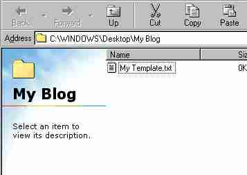
To begin, create a folder somewhere called "My Blog," or something similar. Put a blank Wordpad or Notepad document in there, and name it Template.txt (for instance). With the Template window open, put your mouse cursor in the text somewhere, and right-click: Select-All, then Copy. Now open your blank text document and choose: Paste. Hit the Save button, and you'll have a safe back-up copy of your blogsite template. Yeah, I know, that's pretty basic stuff; but it's better safe than sorry, right? Now it's play time!
Pick a color, any color. Try changing one labelled background, and see which background (if any) changes color when you click PREVIEW. Or pick one called color, and see if you can spot where the text changed hue. If you substitute the word "red" for any color, you can usually spot that quite easily. We're just playing, right now, so don't bother choosing SAVE CHANGES. You can also clear any changes you make by clicking CLEAR EDITS. When I first tried to decifer what my blog template was doing, this is how I figured out what did what, where. It's a start, anyway. Each time you change a color choice in your template, you are modifying the Style Sheet (which starts right after your blog's title). This color-changing game is actually a valuable tool for trouble-shooting problems later on, so it's a good skill to have. Cool, huh? Next post, we'll go back to the six-color website palette you choose earlier.
So what color is my "body"?
If you've come this far with me, then you've learned just enough to create some mayhem, but now enough to do any real harm. Kind of like my fourteen-year-old son. Now, as my old boss at McDonald's used to say, it's time to take what you've learned and apply it to the real world. (Sorry, I never really worked at a burger joint.) We started with color because changing color schemes is one of the simplest and most dramatic upgrades to your blogsite. The trick is in changing the right colors in the right places. That's where this whole discussion gets tricky.
Every template has its own little quirks. Different web designers use various methods to achieve the look they want. If you change your current template to one by another author, you can see huge differences in the way the text inside is displayed. This can be very confusing. It's not just the code that differs, either; some designers use very neat and orderly systems, while others treat their templates the same way they used to treat their dorm rooms.
There's a reason for all this. In the world of HTML and Cascading Style Sheets (both are in your template), most of the white spaces simply don't matter. Your browser doesn't care about neatness AT ALL, only syntax. As long as the right characters are in the correct order, your computer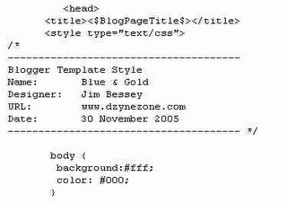 won't mind a bit if the entire template is just one big run-on sentence. So much for what Mrs. Fiddlemocker taught you in Freshman English, huh? This is why we started with colors. Everybody has to have some colors somewhere; and they're usually easy to find.
Using this fake sample template, let's look at the part of your template called body. Everybody's got one of those, too. This body part is usually the big box that holds all the rest of the cool stuff in your template (and, so, your website). For simplicity's sake, I've shown only two attributes for the body of this website: a white background and black text. You don't have to have anything more than this. Your website would be unbearably boring, and fairly confusing in layout, but it would be there. Your browser would simply use default styles and colors for everything you failed to define. (The correct Blogger HTML language would have to be in place, too; but that has nothing to do with what we're talking about here. We're talking about colors, okay?)
If the sample graphic shown was your entire style sheet, you could change your website by fiddling with the two colors listed. You could even have a black blog with pink text, like we talked about earlier. Or you could have a pink blog with black print, but that would be kind of girly-girly, don't you think? Anyway, you have six very nice colors chosen, from your trip to Kim's color-scheme picker. (Six is enough. More than that might be worse than our infamous black dormroom!) How the heck can you find a place to use all six of those colors? That's where we are going to go next. Grab those six cans of paint, and follow me.
Every template has its own little quirks. Different web designers use various methods to achieve the look they want. If you change your current template to one by another author, you can see huge differences in the way the text inside is displayed. This can be very confusing. It's not just the code that differs, either; some designers use very neat and orderly systems, while others treat their templates the same way they used to treat their dorm rooms.
There's a reason for all this. In the world of HTML and Cascading Style Sheets (both are in your template), most of the white spaces simply don't matter. Your browser doesn't care about neatness AT ALL, only syntax. As long as the right characters are in the correct order, your computer
 won't mind a bit if the entire template is just one big run-on sentence. So much for what Mrs. Fiddlemocker taught you in Freshman English, huh? This is why we started with colors. Everybody has to have some colors somewhere; and they're usually easy to find.
Using this fake sample template, let's look at the part of your template called body. Everybody's got one of those, too. This body part is usually the big box that holds all the rest of the cool stuff in your template (and, so, your website). For simplicity's sake, I've shown only two attributes for the body of this website: a white background and black text. You don't have to have anything more than this. Your website would be unbearably boring, and fairly confusing in layout, but it would be there. Your browser would simply use default styles and colors for everything you failed to define. (The correct Blogger HTML language would have to be in place, too; but that has nothing to do with what we're talking about here. We're talking about colors, okay?)
If the sample graphic shown was your entire style sheet, you could change your website by fiddling with the two colors listed. You could even have a black blog with pink text, like we talked about earlier. Or you could have a pink blog with black print, but that would be kind of girly-girly, don't you think? Anyway, you have six very nice colors chosen, from your trip to Kim's color-scheme picker. (Six is enough. More than that might be worse than our infamous black dormroom!) How the heck can you find a place to use all six of those colors? That's where we are going to go next. Grab those six cans of paint, and follow me.
Who wants pumpkin? I do!
Websites are built with more than just a body, of course. Most of the blog site templates you had to choose from when you signed up used at least three basic elements (called divisions in a Style Sheet). Making your 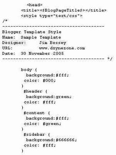 site look great by applying colors will require us to find at least these three sections: Header, Content, and Sidebar. The names may be a bit different in your template,and there are plenty more, but we'll start here to keep things clear. Here's our wildly simplified sample Style Sheet:
Can you read it? What we have so far is our old white background and black text for anything outside the other sections (body). Our new header, where your blog-title would be, is green with white text. The section called content (where blog-posts go) is white with green text. For your sidebar, we have an (evil?) gray background and more white lettering. Pretty dull stuff, but better than black & white, maybe. Don't worry, we'll dress it up soon.
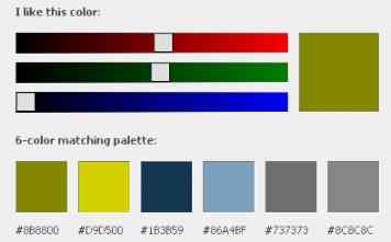
The color scheme I showed earlier as a sample is already taken, by the site you're reading right now. So let's choose a new palette for your blogsite. While we're at it, we'll build a sample site based on a very simple layout, using just the parts listed in our abbreviated style sheet. Then we'll splash your six colors around and see if we can create something jazzy. Here's our new palette:
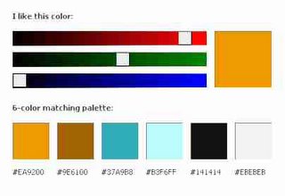
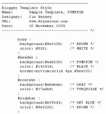
These colors will be loads more fun than the ones I listed above, although the pumpkin primary choice looks a bit garish. I did say jazzy, though, didn't I? By applying different choices from our new palette, we will instantly transform our simplistic blogsite. I'll call the colors by numbers one through six, left to right. Let's try this:
Body: #2 background, with white text.
Header: #1 background, with #5 (black) text.
Content: #6 (gray) background with #3 main text.
Sidebar: #4 background with #2 (brown) text.
I can't promise you this will be a stunning site, since I haven't yet tried it, but you and I will put it all together in the next post, and view the results together.
 site look great by applying colors will require us to find at least these three sections: Header, Content, and Sidebar. The names may be a bit different in your template,and there are plenty more, but we'll start here to keep things clear. Here's our wildly simplified sample Style Sheet:
Can you read it? What we have so far is our old white background and black text for anything outside the other sections (body). Our new header, where your blog-title would be, is green with white text. The section called content (where blog-posts go) is white with green text. For your sidebar, we have an (evil?) gray background and more white lettering. Pretty dull stuff, but better than black & white, maybe. Don't worry, we'll dress it up soon.
The color scheme I showed earlier as a sample is already taken, by the site you're reading right now. So let's choose a new palette for your blogsite. While we're at it, we'll build a sample site based on a very simple layout, using just the parts listed in our abbreviated style sheet. Then we'll splash your six colors around and see if we can create something jazzy. Here's our new palette:

These colors will be loads more fun than the ones I listed above, although the pumpkin primary choice looks a bit garish. I did say jazzy, though, didn't I? By applying different choices from our new palette, we will instantly transform our simplistic blogsite. I'll call the colors by numbers one through six, left to right. Let's try this:
Body: #2 background, with white text.
Header: #1 background, with #5 (black) text.
Content: #6 (gray) background with #3 main text.
Sidebar: #4 background with #2 (brown) text.
I can't promise you this will be a stunning site, since I haven't yet tried it, but you and I will put it all together in the next post, and view the results together.
Is it soup yet?
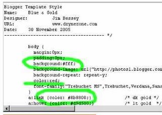
We've been talking about template colors, splashing some random hues around, and then looking at a sample six-color palette to try on our sample website. I named the primary color I used "pumpkin." I choose it because it's bold and easy to distinguish among the six colors offered. In the last post, I  told you we could build a basic blogsite and then apply our color group to it. That's where we're headed, soon. First, let's take a look at our highly simplified Style Sheet (image right).
I've taken the liberty of labeling each of our new colors with actual English names, since the hexa-names are way too hard to memorize. These color names are mine, not the actual names of the exact hues we're using. You can do this, too, when you are mucking around in your own template and changing colors. It really helps keep things clear! Just be sure to use the /* your words */ format you see used in the graphic. (Whatever you write between /* and */ will be "invisible" as code for screen rendering. Cool, huh?)
So now we have a Style Sheet that inserts our sample colors into the four basic parts that are used in most blogsite designs. Remember, we're doing this as a SAMPLE: your template, the names of the parts of your site, and the format your designer used to list information will all be different. I never promised you a pumpkin garden, did I?
What's the point? Did you ever see that great Bill Murray movie, What About Bob?, the one with Richard Dreyfus? "Baby steps." That's what Bob keeps trying to take: baby steps. We're painting the house, not drawing up blueprints, for now. (If you really want to know all about Style Sheets, step by step, and you have a couple hours to spare, try Westciv's excellent TUTORIAL, which is also linked in the right-hand column.) Alright, then, back to our little sample site.
What happens to our blogsite when we change the color scheme? I never showed you what it looked like before, did I? That's because the colors were so boring that no one would want to use them. Picture the paint scheme at your old high school; that's close enough. Our new colors take us right out of high school, beyond our mythical dorm room, and into a very cool and stylish blog office. Okay, maybe I'm driving that metaphor too far down the road. In the next post, using the "picture's worth 1,000 words" philosophy, I'll show you what our color palette looks like, given the Style Sheet info shown above (and a whole lot more information, not shown, which tells your browser all about size, shape, and position). Scroll on down and have a look!
 told you we could build a basic blogsite and then apply our color group to it. That's where we're headed, soon. First, let's take a look at our highly simplified Style Sheet (image right).
I've taken the liberty of labeling each of our new colors with actual English names, since the hexa-names are way too hard to memorize. These color names are mine, not the actual names of the exact hues we're using. You can do this, too, when you are mucking around in your own template and changing colors. It really helps keep things clear! Just be sure to use the /* your words */ format you see used in the graphic. (Whatever you write between /* and */ will be "invisible" as code for screen rendering. Cool, huh?)
So now we have a Style Sheet that inserts our sample colors into the four basic parts that are used in most blogsite designs. Remember, we're doing this as a SAMPLE: your template, the names of the parts of your site, and the format your designer used to list information will all be different. I never promised you a pumpkin garden, did I?
What's the point? Did you ever see that great Bill Murray movie, What About Bob?, the one with Richard Dreyfus? "Baby steps." That's what Bob keeps trying to take: baby steps. We're painting the house, not drawing up blueprints, for now. (If you really want to know all about Style Sheets, step by step, and you have a couple hours to spare, try Westciv's excellent TUTORIAL, which is also linked in the right-hand column.) Alright, then, back to our little sample site.
What happens to our blogsite when we change the color scheme? I never showed you what it looked like before, did I? That's because the colors were so boring that no one would want to use them. Picture the paint scheme at your old high school; that's close enough. Our new colors take us right out of high school, beyond our mythical dorm room, and into a very cool and stylish blog office. Okay, maybe I'm driving that metaphor too far down the road. In the next post, using the "picture's worth 1,000 words" philosophy, I'll show you what our color palette looks like, given the Style Sheet info shown above (and a whole lot more information, not shown, which tells your browser all about size, shape, and position). Scroll on down and have a look!
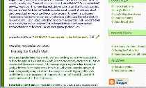
Extreme Make-over: Blog Edition -- the Reveal!
 Here's our new fake blogsite! Now we have cool colors everywhere, especially that big pumpkin-hued top banner (the header). Wondering what all the tagged titles are? Those are the magic behind your blog; they become real words and regular text (and some hyperlinks, too) as soon as your template is loaded onto the Blogger host server.
Don't let those tag-items throw your eye off. I built this site for layout and colors, to show you what we could do with a little editing. If you look at our abbreviated Style Sheet in the previous post, you'll see the references to every main color shown in the picture. There are some other little tweaks in there, which you've probably spotted by now. Those link buttons in the right sidebar use our color palette, but have their own special descriptions. I left them in because they turned out alright visually. In a future article we can take a look at styling link buttons: those are tons of fun, and only tricky the first time around. I'll also post a link to the complete template text for this sample site shortly. I've already written more than I'd intended, since I wanted our newly-decorated blogsite to speak for itself! Until then...
Saturday, November 26
Where do we go from here?
We've spent a lot of time on color. That's okay, because color changes everything. I hope you've seen what an incredible difference color choices and color palettes can make, even using fairly simple stock templates. But how can you make a website truly your own? Do you have to learn CSS and HTML coding, then code your own site from scratch? Or go out and purchase a full-scale editor like Dream Weaver or Frontpage and work your way through their tutorials? Should you go to one of the dozens of template sites and start fresh from there? Well, you could. Any of those choices can lead to a beautiful custom website for you. If you are in the midst of developing your new business web presence, you will almost certainly want to use your host's best templates and creative suggestions. But we're blogging here, not web-marketing. So let's look at a simpler option for blogsite interior-decorating.
Images offer the ultimate customization. When you uploaded a picture for your Profile, you created a web element not offered anywhere else: a picture of YOU, or one representing you. As you've also seen, you can always add a picture or two to any post you create. Many Bloggers post pictures all by themselves, in a Blog version of a photo gallery. Those pictures add visual appeal to your posts, but don't change the essential look of your site. Furthermore, if you post lots and lots of pictures in your Blog, and if those pic's aren't highly compressed images, eventually your site will load so slowly that your readers will become irritable. We can't have that, now, can we?

What we need, then, are background images! Those are pictures or artistic elements that stay right where you place them, living happily with-in the base code of your website. If you followed along in the color articles, you probably noticed image URL's after the word background for some divisions in your template. If you tried to change that division's background color, but left the image in place, then you probably didn't see any difference in the way your site displayed. The reference to an image, listed after the color-choice for background, covers the base color with the picture. (If the picture is slow to load, though, you will see that division filled in with the correct color--until the image finishes loading.)
We'll take a good look at background images, then, in the next post. See you there!
What's that in the background?
Background images are different from regular images. That picture of your puppy peeing on the new carpeting is a regular image. You post it, and maybe you add some text about how much you love your pet, no matter how bad he is. Your Profile Image is also a standard image, displayed inline with the rest of your Profile text. (That just means the image falls in line with whatever comes before and after it in your page's source code.) When you define a background image, though, you are creating a type of wallpaper. You all know about wallpaper, don't you? The difference is, you can put stuff over or on top of it, just like in your house (or the screen of your computer, for example).
The other difference lies in how your browser displays those images. When you posted your puppy pic you wanted just one copy to show, and that's what you got. But background images are displayed as TILED, unless you specify "no-repeat." Fancy backgrounds and interesting borders are often composed of a small, single image repeated either all over the page or in a straight line up or down. These tricks call for a bit more attention to detail than a simple photo-post. For one thing, when you compose a post the internal post-editor writes all the code for you, based on what you chose for size and position when you uploaded your photo. If you check Edit Html (next to "Compose") before you post an uploaded photo, you can read the code that was placed there for you.
The safest place to specify a background image is in your Style Sheet, the same place we plundered before to change colors in our last series. Every division in your Style Sheet (body, content, sidebar, etc) can have its own background image, just as it can have its own background color. The word background, followed by an original color selection, then by a URL for an image (that image's online location), will pull in that image for you when the page loads. It's good to specify a background color, just in case the pic you picked won't load, for whatever reason. There's one more important step, though.
If you don't tell the browser what to do with your background image, the browser will repeat it all over the section your defined. That's called tiling, just like in the bathroom in your old apartment. For tiny, basic images that can be fun. But if you want your picture to show only once, you say "no-repeat." Not out load, but like this:
background: url("www.photoplace/folder/photoname")no-repeat;
You'll have to supply the locations, of course. You can see a clear example of "no-repeat" at the top of this website, where our logo is displayed. Now, if you want your image to repeat left-to-right, in a border for instance, write it this way:
background: url("www.photoplace/folder/photoname") repeat-x;
If you remember your high-school math, "x" is across. So, then, "y" would be down, huh? Like this:
background: url("www.photoplace/folder/photoname") repeat-y;
That's not so difficult at all, is it? (For an example of "repeat-y" just look down the far-left side of this page.)
There's more to it than that, if you need to tweak your image's size or location, but those are the basics, and they work just fine most of the time. If the image you want is already online, in your photo gallery perhaps, and it has its own distinct location, you can simply paste in the URL. Otherwise, you can upload your picture or artwork directly into a post. Click Edit Html and copy the picture's location (read between the quotes). Add the information to your template, in the division where you want it, and see if you like the results. You can always choose "Clear Edits" to reverse your actions. Try it, and come back.